Contrasting Color (CC)
A clearly different yarn color used for standout details or temporary marker rows in your knitting.
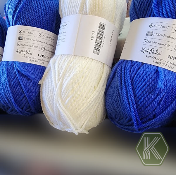
Contrasting color is a yarn color that is intentionally different from the main or background color so it stands out clearly in the finished fabric.
In machine knitting, a contrasting color is often used to:
Emphasize borders, cuffs, bands, or hems
Create stripes, motifs, or text that are easy to see
Highlight design details such as pockets, button bands, or decorative seams
Add a temporary marker, marker row, or separator to make shaping steps easy to spot while knitting
A color can contrast by being lighter or darker, a different hue (for example, blue against orange), or much more or less saturated than the main color. For the strongest effect, choose a contrasting color that is clearly different in value (light vs dark) so the stitch pattern and shapes are easy to see from a distance.
Patterns may abbreviate contrasting color as CC and main color as MC.